Showing posts with label Mohammed Ali Ahmed. Show all posts

Saturday, 28 January 2012

MY LAST POST

I HAVE OFFICIALLY FINISHED!

THANKYOU AND GOODNIGHT


Evaluation: Question 4

What have You Learned from Audience Feedback?


After watching mine and everybody else's music video in the cinema, I asked a couple of people what they thought about our music video and this is what they said:


Evaluation: Question 3


Evaluation: Question 2

How effective is the combination of your man product (video) and ancillary texts (digipak and advertisement)?


Advertisement and Music Video
Digipak and Music Video
Digipak, Advertisement and Music Video


Evaluation: Question 1


Wednesday, 11 January 2012

FINAL DIGIPAK!


FINAL ADVERTISEMENT!


Production of FINAL Advertisement

When creating the advertisement, I kept it consistent with the digipak by the same colour scheme. I added the critiques from ‘The Sun’ newspaper and the ‘BBC Radio 1’ saying how good Yumi is and the album. I added how you can purchase the digipak and when it will come out. I added where you can pre-order so that they can immediately buy it. I added the webiste where it consist of backstage interviews and gossips –giving more to the audience, making it feel special by giving them more. I also added  a ‘QR Barcode’ so that people with smart phones can scan it and immediately go and access the website and buy the album. I made sure to include the digipak so that the digipak is also getting promoted. 


Production of FINAL Digipak

When creating the Digipak, I shall be using ‘Fireworks’ as my means of producing the Digipak.


Click to enlarge image

When creating the digipak, I wanted an image where she is laughing and showing that she is having a good time which should reflect on the digipak and the songs. During our photo shoot, Mika made sure to have some of these when she took the pictures. Here is the one that I will be using which I think is perfect. Here expressions are very clear and distinctive. She is in a good stance. 


Even though the photograph was great, all I needed was her without her guitar. This is because when I place her at the front of the digipak, it should promote just her. This mean I had to get rod of everything –the background and the guitar. I did this fist by going to the toolbar and using the ‘Rubber’ and turning its size to maximum, I rubbed out the whole of the background in quick succession. However, I needed to be precise around the image of our artist –Yumi, which meant that I had to use the ‘Magic Wand’ tool to give precise cutting of the unwanted imagery. 


What happen when I use the rubber tool which rubs out the image

After rubbing out, I used the magic wand tool for the precision  around the image


While concentrating on the position of the image, I had a idea that I wanted to flip he image so that it faced the opposite way because otherwise, her eye would be cut out when I placed it on the right hand side. So in order to flip it, I pressed right click on the image and went to ‘Transform’ and then went to ‘Flip Horizontally’ which have me the flip effect which was perfect. Here you can see the outcome of flipping it the way I wanted it to be. 


To create the illustration, I needed to draw over the actual image of Yumi. I did this by using the ‘Brush’ tool from the tool bar.


The colour scheme that I chose was similar to the colours used on the ‘Kesha’ album because it conveyed beautifully the emotion of the artist and the feeling of the digipak. So I decided to use them for my Digipak. 


Here you can see that I am selecting the colour from the Kesha album that I want to use for my one. I can change from different colour-to-colour depending on which colour want to use next. I used a range different colour wit different tones from purple, blue and white. 
Here you can see the beginning of how I started to colour Yumi in. I used the colour purple but I used the dark tone one to give it texture and a 3D quality. I used a range of the colours with there different opacity. Here you can see that I’m now focusing on the colour white on the lighter side of her face by using the paint brush. 
Here is the final result of me painting Yumi in. You can see that I experimented with the range of colours and how I created the hair look by just swivelling the brush stroke by making her hair be curly. (Or as my fellow group members called it –a Mop look).


Here is the image that I want to use with the same effect as the front cover. In this case, the images are different because their positioning are changed and I decided to go with her and her guitar creating her character and who she is as an artist. The shadow that is created by them gives it a 3D look and it makes it look and feel real –that we can actually feel how she is feeling all with the help of the combination colours creating that feeling. 


Original Photo

My Illustration by the Brush Tool


Here is the image that I will be using when creating the inside of the digipak. I want the each panel to consist of this image with each image looking at each other with the pink transparent effect. Theses images will not be illustrated. I created the pink transparent by creating a box from the tool bar and then adding the colour pick then going to he ‘Opacity’ and changing it to 29 giving it that transparent effect which I used for both the front and back cover and the inside of the digipak. I also used it for the advert. 


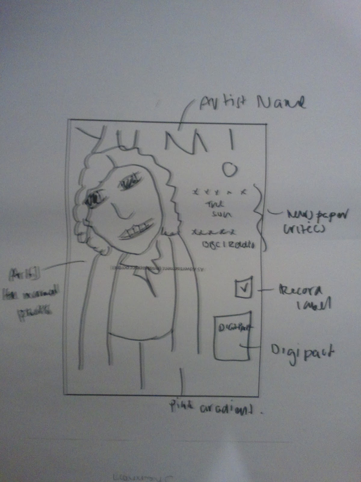
Final Storyboard for Advertisement

Here you can see the rough storyboard for my advert. I wanted to have the original image of the artist so that people can recognise who she is. It should have a pink filter on it like the Digipak. I want to have some critiques from newspaper and radio show to comment on how brilliant the album is and she is so that people would buy it. I will also add information about how you can purchase it like through Itunes. On then top of the advert should have the artist name YUMI spelt as YUM!

Storyboard for FINAL Digipak

Here you can see my storyboard of my Digipak and what goal I would like to achieve. (Apologies for the bad drawing!) I wanted arrange the front cover of the Digipak by having the artist image at the edge on the right hand side. This is because I wanted the shadow to be formed giving the image a 3D effect – realism. It was also because the stance that she is in, where she is looking at the right hand side, if I was to place that image in the middle, it felt out of place. I wanted t follow the idea of the Rihanna digipak by having the artist name spread out across at the top with the title of the album spread out at the bottom. I wanted to keep he colour scheme same and consistent for every panel and the advertisement. The title is called YUMI but I turned the ‘I’ into an exclamation mark to have some voice – YUM!


Front & Back cover of Digipak
At the back of the digipak, I have the image of our artist laying her back against the wall with her eyes closed to show how she feels the music with her guitar. I also want the track list to be formed by having it cascade down and shifting towards the right hand side. This is because it should almost sit comfortably on the slanted guitar –where the music comes from. The font of the text will be the same – Ariel. The back cover will also contain the relevant information that usually goes with a conventional digipak like the record label, barcode etc. Both the images that consist on the front and back of the digipak should be illustrated – drawn over the original image because I want the feeling of how the artist is feeling to be emphasised and to be powerful. 


The inside of the digipak will of course consist o the CD and the background should have the original images of the artist behind a pink box that is slightly transparent, acting as a filter to give off a light pink colour. 
Inside of Digipak

Research: What makes a good looking Digipak

During the lesson on Friday 6th January, I was looking at everybody else’s Digipaks and started to see that most people used the original photographs with effects on. I was concerned whether or not my Digipak cover might have been too much with an illustrative interpretation of our artist. I told Annabel this and she said that it was ‘completely ok’ and that ‘I was doing the right thing’. This gave me reassurance as she said that most of the successful Digipak covers are based on illustration or have some kind of motifs. She said that I should look at Google Top Ten Digipak, which I did and saw that the really good ones had illustration on. I think the reason is because it makes the message come alive. Here are some that I found at Google Top Ten Digipaks and http://inspiredology.com/99-best-designed-album-covers/ that I like:


Kesha Album Cover
Michael Jackson Album Cover

Bruno Mars
My Chemical Romance
But my favourite one is the Kesha album cover because I like how the limited use of colours are used to convey how the artist is feeling. It also suits the genre that the artist belongs to which is the same as our one which is RNB/POP. I really love how they used the original photo of the artist and literally painted her over. This idea I really love and hope to achieve perfectly with my Digipak. The colours really accentuates the mood and what type of feeling you would get listening to the album.

My colours that I have picked and sticking with the ‘3 colour rule’ are purple, blue and creamy white with their different tones like darker and lighter of the desired colours e.g. dark/light purple.


Thursday, 5 January 2012

First Draft Design of Advertisement


Here is a very basic mock up design of the advertisement. You can see that the Digipak will be included in the advert and the relevant information like the tour dates and when the Digipak will be out in what store etc. 


Second Draft of Digipak

Here is another draft of my Digipak which I am quite pleased with myself because of the amount of detail I have put in it. Staying with the guidelines, I put minimal material at the front cover to keep it simple and effective and understandable. You can see that I have drew our artist in a stance with her finger covering her lips to show that she is keeping her songs hidden from the audience and the only way they would find out that information would be buying the Digipak. I have made sure to just have a medium close up of our artist because that is how most conventional front covers consist of. 


You can see that I have the artist name written upon her hair acting like a motif of being special and unique, coinciding with the lyrics to the main song ‘Who You Are’.  I have written ‘who you are’ at the bottom in capitals like the Rihanna Digipak. I have focused on the make up of our artist which I thought I would add artificially on the computer. This is because I want the colour to connote the genre which is ‘RNB and Pop’ and the make up colour should be consistent with the colour design of the ancillary products – but that’s just an idea!

At the back cover, I thought about the idea of secrecy because of the first feeling you get when you lose who you really are. I wanted this to be the opposite picture of the front cover giving you an inside of the two feelings of the song and the Digipak. I drew her behind a paper fan because of the masquerade feeling. On the fan, I have the titles of the songs that consist in the Digipak.

I have also taken the initiative of putting the relevant information like the barcode and the record label etc.

First Draft Design of Digipak

Here is one of the practise designs of a Digipak that I created which was inspired from Jessie J’s album. It was crucial to have the artist on the front of the Digipak which I thought had t convey the type of artist she is. Looking at the Jessie J album, there is a lot of dark colours used to show that this albums going to consist of man heartfelt songs that emphasises the emotions. I wanted this same effect on my design mock up so instead of using black, I felt a multi colour palette would fit prefect to show the different variations of feeling and emotions like the colour red connoting love. I wanted the picture of the artist to be an exaggeration of a particular feeling so I dramatised the lips melting to show how the passion of love is dripping away – she is losing herself.


I also concentrated on the effect I wanted out of the artist name. I decided to copy the effect used in the Jessie J album so I decided to go with the flowing letters and the orange and yellow colour combination with the white glare coming off of it, giving it that special shine.

I added a flying bird onto the front cover of the Digipak as a metaphor to show how our artist has grown her wings and is finally ready to be set free and be who she wants to be. Hopefully this message should inspire the audience who would buy this because they would see our artist as a role model.

I showed my teacher Rebecca about what she thought about it and at first glance she said it was really striking but I didn’t keep in with the guidelines because “you are only allowed 3 colour combination which must be consistent and also there’s too much going on at the front cover which makes it a bit confusing”. I took on board this critique and hopefully when I create my second draft of my Digipak, it should work. 

Guide Lines for Ancillary Work


Here is the worksheet that shows the outlines of what should go on the ancillary products and what shouldn’t.


Example of Jessie J Advert


Jessie J Advert


Andy Warhol and Roy Lichtenstien Artwork
Here is an advertisement that I saw on a humungous billboard. The advertisement is promoting Jessie J, which coincides with the release of her new album. I really like this advert because not only is it striking by the colours used and her outfit, but also it combines a famous artwork by Andy Warhol and Roy Lichtenstein with the artwork of which is Jessie J. I like this idea because it shows that you are not limited in what you produce for your advertisement, you don’t always have to follow the conventional production of an advert.