When creating the Digipak, I shall be using ‘Fireworks’ as my means of producing the Digipak.
 |
| Click to enlarge image |
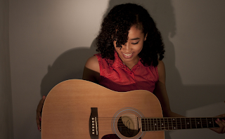
 When creating the digipak, I wanted an image where she is laughing and showing that she is having a good time which should reflect on the digipak and the songs. During our photo shoot, Mika made sure to have some of these when she took the pictures. Here is the one that I will be using which I think is perfect. Here expressions are very clear and distinctive. She is in a good stance.
 Even though the photograph was great, all I needed was her without her guitar. This is because when I place her at the front of the digipak, it should promote just her. This mean I had to get rod of everything –the background and the guitar. I did this fist by going to the toolbar and using the ‘Rubber’ and turning its size to maximum, I rubbed out the whole of the background in quick succession. However, I needed to be precise around the image of our artist –Yumi, which meant that I had to use the ‘Magic Wand’ tool to give precise cutting of the unwanted imagery.
 |
| What happen when I use the rubber tool which rubs out the image |
While concentrating on the position of the image, I had a idea that I wanted to flip he image so that it faced the opposite way because otherwise, her eye would be cut out when I placed it on the right hand side. So in order to flip it, I pressed right click on the image and went to ‘Transform’ and then went to ‘Flip Horizontally’ which have me the flip effect which was perfect. Here you can see the outcome of flipping it the way I wanted it to be.
To create the illustration, I needed to draw over the actual image of Yumi. I did this by using the ‘Brush’ tool from the tool bar.
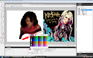
The colour scheme that I chose was similar to the colours used on the ‘Kesha’ album because it conveyed beautifully the emotion of the artist and the feeling of the digipak. So I decided to use them for my Digipak.
 Here you can see that I am selecting the colour from the Kesha album that I want to use for my one. I can change from different colour-to-colour depending on which colour want to use next. I used a range different colour wit different tones from purple, blue and white.
  Here you can see the beginning of how I started to colour Yumi in. I used the colour purple but I used the dark tone one to give it texture and a 3D quality. I used a range of the colours with there different opacity. Here you can see that I’m now focusing on the colour white on the lighter side of her face by using the paint brush.
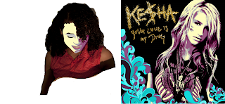
 Here is the final result of me painting Yumi in. You can see that I experimented with the range of colours and how I created the hair look by just swivelling the brush stroke by making her hair be curly. (Or as my fellow group members called it –a Mop look).
Here is the image that I want to use with the same effect as the front cover. In this case, the images are different because their positioning are changed and I decided to go with her and her guitar creating her character and who she is as an artist. The shadow that is created by them gives it a 3D look and it makes it look and feel real –that we can actually feel how she is feeling all with the help of the combination colours creating that feeling.
 |
| Original Photo |
 |
| My Illustration by the Brush Tool |
Here is the image that I will be using when creating the inside of the digipak. I want the each panel to consist of this image with each image looking at each other with the pink transparent effect. Theses images will not be illustrated. I created the pink transparent by creating a box from the tool bar and then adding the colour pick then going to he ‘Opacity’ and changing it to 29 giving it that transparent effect which I used for both the front and back cover and the inside of the digipak. I also used it for the advert.


No comments:
Post a Comment