The audience seemed to really enjoy our music video apart from the little blip in in. The audience feedback we recieved was quite positive. Below are two feedback videos I have chosen:
The video is not uploading, however here is the link to the video feedback:
One think which Nick commented on was the performance, this is actually something we went back and re-recorded to improve it as it wasn't as good as it is now. He also mentions the over the shoulder shot, which was also another shot which we went back and filmed.
Personally I think there could have been improvements, however most of the major flaws, we suffered at the start, we went back and ironed them out. I think the last shot of her standing in the leaves for example would have been better if they came from both sides. Also i would have planned better, as most of the shots were filmed on the day and not planned in advanced. This would of allowed us to spend less time filming day after day with useless footage and it would of meant more time in the editing suite.
The shots im most proud of is the jump cuts and the shot where the surrounding around Yumi is sped up.
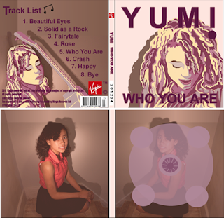
As for my digipack people said they really liked it, especially the track listing layout as it's in a polaroid style. They saw the link between the video and the album cover, the guitar being the common factor between the two.
Some wernt so keen on the colour, but i explained that i chose brown as it was neutral and the colour's meaning.
If i could improve my digipack i would take the photos myself and make sure thats there's not alot of shadow in the image as it looks really bad on the CD cover. Also making sure that the background is contrasted with the colour of the outfit as this would make it easier when using the magic wand tool.
Here is a link to my digipack:
The review of my advert was quite good aswell as people saw the connection between the CD and poster as the same colours and fonts were used throoughout. They also picked up on the star ratings which gave them an idea of what the music industry thought of the album.
Although they liked it i would have changed the picture, looking back i dont think it looks as nice. Also where the album title and name is, i would have liked to place it somewhere else as i feel its not best suited there. From feedback they said I could of filled the gap with some informtion as it looks bare.
Here is a link to my advertisment:
 Julien's comments on my digipak: